
how about growing yourself a “Winter Border Garden”? This little lap quilt is quick to bloom because it makes great use of a border print. Just pick some colors from the print, sew up some strips, and voila! A pretty little top, ready to quilt. I just did quick stippling, a bit of echo stitch above the garden and a simple flower in the center. I love the vibrant jewel tones with black, but I’m now thinking about doing one in pastels for the spring. If you want to join me, the pattern is on sale this week through Feb. 28 for $3.50: Click here.

I thought a lot about the colors before I started–of course, that’s really the fun part of quilting. Originally, I had in mind a lot of purples, pinks and mulberries, which I’m sure would have been lovely. However, when I looked at the piece again, the oranges and yellows really jumped out. I decided to switch up my plan. Someone asked me once how to pick colors. It’s personal, but here are some pointers.
First, take a pattern, floral or other, that you plan to use as a key piece. Consider the background because that may be key. If it had been white or cream or blue, I wouldn’t have picked a solid black.
This pattern calls for 6-8 stripe colors. I could have picked one color, such as purple or cranberry and done a variety of different shades. However, since the flowers in the print were multi-colored, I wanted to use multi-colored stripes.

The stripes in the 1st photo may look like solids, but most of them are not. Many are tone-on-tone little prints, but they read as solids. I selected from a pile of potential colors. I don’t know that my color choices are what you would pick–they are really strong here, I admit–but I have some underlying guidelines I follow, which I’ll try to explain.
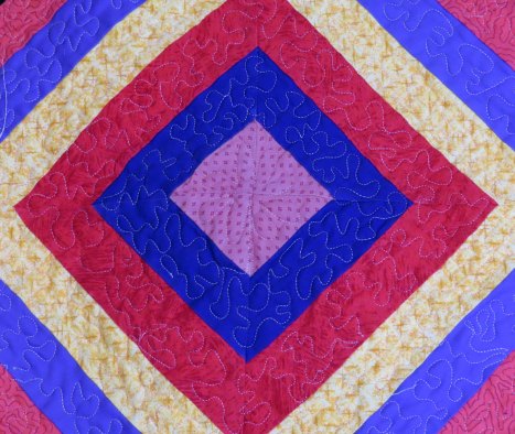
I could have used green because there’s clearly green in the garden. The truth is that I just didn’t seem to have the right shade of green in my small scraps. I must have tried a half dozen and finally just dropped the idea. I definitely wanted the purple because I had two nice shades to use-yes, those are purples, not blues, but they do lean violet. I eliminated a plum that looked sick beside the yellow and coral.
I wanted yellow, but it couldn’t be too light because the other colors were so vibrant. Think about matching color saturation. I wanted it deep, but not brownish gold and not too orangy. (Probably not a real word, but you get it!) Speaking of that, there’s a bright orange flower that I just ignored because putting bright orange with black smacks of Halloween.
Interestingly, there’s no coral in the print, but that’s what I ended up choosing for the backing, binding, narrow folded inner border,and outer ring of the stripes. It’s a vibrant coral with a lot of orange, but softened with pink so that it actually goes well with orange and pink. I picked a very warm deep pink for the center–I tried a bright candy pink, but it was awful–I definitely needed a warm red-pink rather than a cool blue-pink. Also, the red isn’t a true red, but an orangy red that blends well with the coral, too.
It’s not really about exactly matching. You have to constantly look at the colors together and rehearse them a little to make sure they’ll blend. I even found when I lined up the stripes that I had to switch them. Some just do not like to lie beside each other–they fight! There’s a fine line where you want contrast, but not clash, even in these brilliant jewel tones.
Saturated jewel tones go together, but I could never have added some browns or tans or olives to this combination just as I avoided throwing pastels into the mix or soft muted gray-blues, gray-greens or heathery (I think I made that word up, too) lavenders. It was better to stick with warm and bright tones for the most part. That much black is strong and needs the saturated hues to balance.
I’m fairly happy with my choices, but honestly, I think it’d be fun to try it again with a white or cream background and different print for a totally different effect, something more delicate. I’m also thinking that center would make a cute pillow top, and it’d be fun to put a pretty border all around a big quilt. Or I could do all the stripes in florals–an interesting challenge. Always another idea, another project…..until later! Libby